Graphing Linear Relationships
Creating and interpreting graphs is an essential skill in general chemistry. Since most first-year students are not expected to know programs like Excel or Google Sheets, the lab provides a guided introduction to using spreadsheets for graphing.
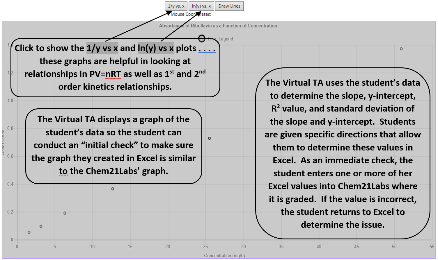
Chem21Labs embeds a graph of the student's data directly in the lab report, allowing students to compare it with their own spreadsheet graph as an initial check. Students then enter values such as slope, y-intercept, R2, and standard deviation, receiving immediate feedback. If needed, they can repeat the guided process to correct errors.
In addition to the default y vs. x plot ( y vs. x button is enabled), optional views ( 1/y vs. x and ln(y) vs. x ) help analyze gas law relationships and reaction kinetics. Instructors can also require trendlines to pass through the origin when appropriate.
A More Information link provides guidance on graphing with Excel and can be expanded or collapsed to save space.
Graphing with Excel
- Open Excel by clicking on Start, All Programs, Microsoft Office, Microsoft Office Excel
-
Place your "x" values (the following [show=] syntax is used in Chem21Labs to "redisplay" a value that resides in the database . . . . the student will not see the [show=] text, they will see their actual lab data) [show=11], [show=21], [show=31], [show=41], [show=51]) in cells A1 – A5 and your "y" values ([show=12], [show=22], [show=32], [show=42], [show=52]) in cells B1 – B5. To enter values into cells, click the cell and type the number then press ENTER – enter only numbers in the spreadsheet. You can also copy / paste the values (see table to the right) by clicking on [show=11] and dragging / highlighting until the cursor is on [show=52] and all values are highlighted. Copy (Ctrl + C) the values to your clipboard, click in Cell A1 in Excel, and Paste (Ctrl + V) the values into Excel.[show=11] [show=12] [show=21] [show=22] [show=31] [show=32] [show=41] [show=42] [show=51] [show=52] - Click on the INSERT tab and then click on the SCATTER chart in the CHARTS area. Click on the SCATTER WITH ONLY MARKERS icon.
- This will place a chart on the page. To make sure the chart is graphing your data correctly, right-click in the white area on the right side of the chart and click the Select Data link.
- Click Series 1 to highlight it and then click the Edit button. Make sure the X values are '=Sheet1!$A$1:$A$5' and the Y values are '=Sheet1!$B$1:$B$5'.
- Click OK and then click OK again.
- Click the graph to select it and then click the '+' icon that appears to the right. Check the Trendline option.
- To place the Equation and R2 value on the graph, mouse over the space to the right of the word 'Trendline' and click the arrow that appears. Click MORE TRENDLINE OPTIONS and then click Display Equation on Chart and Display R2 Value.
- Your graph will be displayed along with the equation for the 'best-fit' line through the 5 data points. Report the slope of the line below. If the slope in the Excel equation doesn't have at least 3 Sig Figs, click in an empty Excel cell and enter the following starting with the equal sign: =slope(B1:B5,A1:A5). Press the Enter Key and the slope will appear.
- Add a Chart Title and Axes Titles (click the chart, highlight the Design tab, click the Add Chart Element button).
To search for a video on how to create a graph, add a trendline, determine the slope and y-intercept of the best-fit line, and format the title and axes, click Graphing with Google Sheets or Graphing with Excel to open a search page with video options.