

Graphical Display of Lab Data
Many chemistry labs use sophisticated instruments to collect data at set time intervals, often generating large datasets that are difficult to interpret without graphs. The four graphs below highlight key features of the Chem21Labs graphing application.
|
Titration Curve (Weak Acid) The pH vs. mL NaOH graph shows a diprotic weak acid, with two inflection points and two pKa values. Students paste their x-y pH data into the lab report, where it is saved and used by Chem21Labs to calculate inflection points, pKa values, and corresponding NaOH volumes before displaying the graph. Buttons allow viewing the first and second derivative graphs. 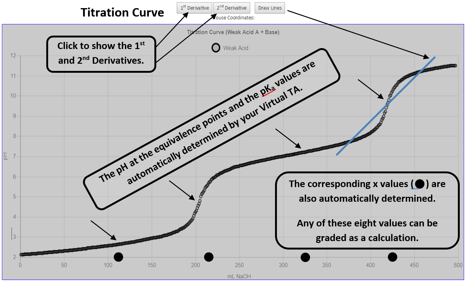
Freezing / Melting Curve In a freezing-point depression lab, students collect temperature data with a probe. Afterward, they use the Chem21Labs graphing tool to draw lines on the graph; their intersection gives the freezing point. 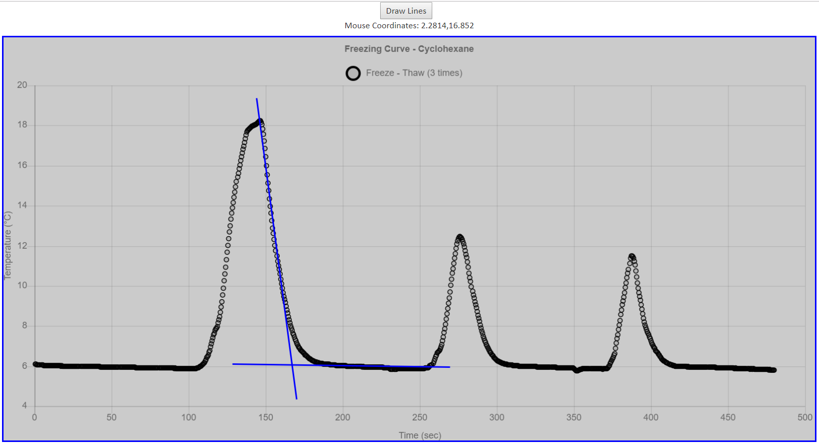
|
Pressure vs. Time Curve The decomposition of Hydrogen peroxide (H2O2 (aq) → H2O(l) + O2 (g)) is studied by measuring O2 pressure over time. The experiment begins by lowering pressure with a syringe plunger. As O2 forms, pressure rises; when it reaches atmospheric pressure, the plunger is withdrawn 2 mL. This cycle is repeated for eight readings. Afterward, students mouseover graph data points to find the exact times at which pressure reaches atmospheric levels, then use this data to determine the rate law. 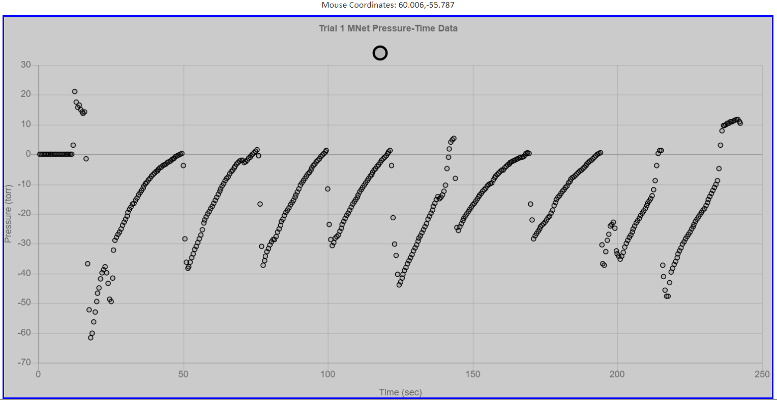
Absorbance vs. Wavelength The Chem21Labs graphing app can display up to seven datasets on one graph. Plotting absorbance vs. wavelength at seven pH values creates a stacked graph that quickly reveals the pH where the indicator absorbs the most yellow light (λ = 550 nm). 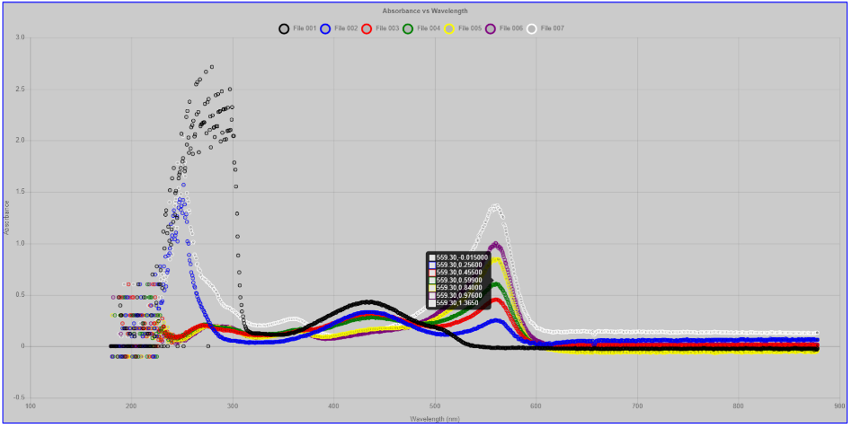
|
Also, the Chem21Labs program can display class data provided by the instructor.